

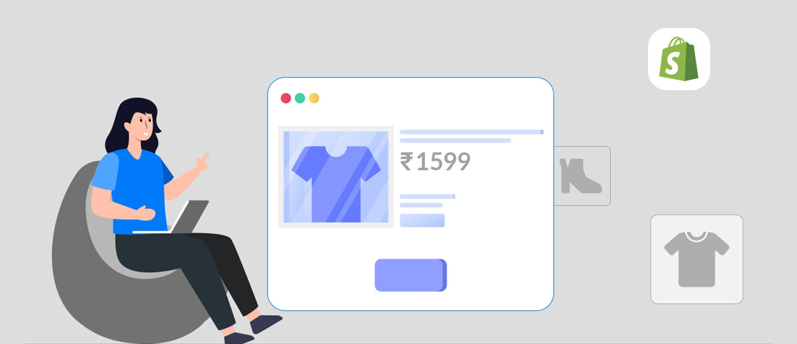
Let’s be real - getting traffic to your product page feels great. But conversions? That’s where things actually get exciting.
Over time, while working on multiple Shopify brands, we’ve realised one simple thing: a high-converting product page isn’t about doing more - it’s about doing the right things, really well.
Here’s what actually works (with a little bit of what we’ve seen firsthand)
1. First Impressions Really Do Everything
You don’t get a second chance here.
When we worked on Nama Home, one thing we focused heavily on was clean, scroll-friendly visuals. No clutter, no chaos just strong imagery that lets the product breathe.
Because if your page looks overwhelming, people don’t stay long enough to care.
2. Titles Should Feel Like Something You’d Actually Say
No one gets excited by “Beige Co-ord Set.”
A good title sets the mood. It gives context. It feels human.
Think of it as the first line of a conversation - not a label.
3. Your Description Shouldn’t Sound Like a Spec Sheet
We’ve all seen those robotic product descriptions. Nobody reads them.
The trick is to write like you’re casually explaining the product to someone who just asked,
“Hey, is this worth it?”
Keep it easy, relatable, and focused on how it fits into their life.
4. Don’t Just List Features - Tell Me Why I’ll Love It
This one changed a lot for us.
For Trisara, instead of just listing details, we added a small section called
“Why You’ll Love This.”
It sounds simple, but it works - because it translates features into real reasons to buy.
Not just what it is, but why it matters.
5. Your ‘Add to Cart’ Button Shouldn’t Play Hide & Seek
This sounds obvious, but it’s often missed.
Clear placement, strong contrast, easy to spot - no overthinking.
When someone decides to buy, don’t make them look for the button.
6. Trust Isn’t Built by Accident
People hesitate before buying especially from newer brands.
For Amber Stitch and Trisara, we designed clean trust icons (shipping, returns, quality assurance), and honestly, they made the page feel instantly more reliable.
It’s subtle, but it works. The page just feels… safer.
7. Break the Scroll (In a Good Way)
Big chunks of text = instant skip.
Use:
* bullet points
* small sections
* visuals that show the product in real life
The goal is to make scrolling feel effortless, not heavy.
8. A Little Urgency Helps (But Don’t Fake It)
Things like “Only a few left” or “Selling fast” can push decisions, but only if they’re real.
Customers can tell when it’s forced, and that breaks trust faster than anything else.
9. Mobile Experience Can Make or Break You
Most people are seeing your page on their phones.
If it’s not smooth, fast, and easy to navigate you’re losing conversions without even realising it.
At the end of the day, a good product page doesn’t try too hard.
It just makes things clear, trustworthy, and easy to say yes to.
At WTF Media, we’ve spent a lot of time building and refining Shopify product pages across different brands and honestly, the smallest tweaks often make the biggest difference.
If you’re looking to make your product pages not just look good, but convert better, you know where to find us.
Share:
Performance Marketing Budget Allocation: How to Distribute Your Ad Spend Across Channels
Technical SEO for E-commerce: Fixing the Silent Issues That Kill Your Rankings